Trudi, lovely cards! Is that sunflower paper from HL?
Terrie, great use of your colors. Your pink flowers really pop!

Luck be a Lady pt. 2 - challenge June 27 - July 4
Moderator: Ellie
24 posts
• Page 2 of 3 • 1, 2, 3
Elaine
- eoconnell
- Posts: 3621
- Joined: Sun Nov 09, 2014 4:21 pm
Terrie I love that you mixed patterned papers as the background, it really made your ATC card pop!
- Trudeenr
- Posts: 2085
- Joined: Sat Nov 08, 2014 6:56 pm
Oooh Terrie, I love it! The color combination is so pretty! I know the colors the dice gave you were a challenge but you really rocked it! Great job and I am so glad your third color was pink! Gorgeous! Thank you for playing along
Barry
- Prince of Paper
- Posts: 976
- Joined: Tue Nov 11, 2014 12:38 am
Trudi and Terry, you both did beautiful cards!
Golda
GoldaPete.WordPress.com
GoldaPete.WordPress.com
-

Golda - Posts: 4411
- Joined: Sun Nov 09, 2014 7:05 pm
- Location: Phoenix AZ
Okay, my 2 colors were teal and red. My favorite color and my least favorite color.
For this one, I needed a thank you card for my SIL and his favorite color is purple. So, paired those 2 with purple.
For this one, I needed a sympathy card, so I paired the 2 colors with black.
This was challenging, but fun. And, I got 2 of my ABSOLUTELY NECESSARY cards done. I have about 6 more cards I need to make right away. Now, for time to get them done.
For this one, I needed a thank you card for my SIL and his favorite color is purple. So, paired those 2 with purple.
- 7-2-21 WCC for Tom (300x240).jpg (81.73 KiB) Viewed 807 times
For this one, I needed a sympathy card, so I paired the 2 colors with black.
- 7-2-21 WCC Sympathy Shyann (246x300).jpg (89.34 KiB) Viewed 807 times
This was challenging, but fun. And, I got 2 of my ABSOLUTELY NECESSARY cards done. I have about 6 more cards I need to make right away. Now, for time to get them done.
Golda
GoldaPete.WordPress.com
GoldaPete.WordPress.com
-
Golda - Posts: 4411
- Joined: Sun Nov 09, 2014 7:05 pm
- Location: Phoenix AZ
Good job Golda. It's always difficult working with your least favorite color but they do contrast really well together.
Elaine
- eoconnell
- Posts: 3621
- Joined: Sun Nov 09, 2014 4:21 pm
You did great with your given colors.....TFS
- terrie
- Posts: 2936
- Joined: Sun Nov 09, 2014 5:46 pm
Golda I love what you did. The red really sets off the teal and brings the image inward and more focused. I really like both of them. Great job on this challenging assignment.
Barry
- Prince of Paper
- Posts: 976
- Joined: Tue Nov 11, 2014 12:38 am
Wow... you have all rocked your color combos. And most were really challenging.
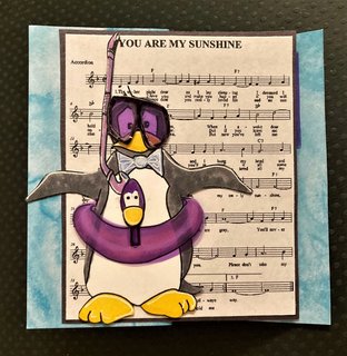
The colors Barry provided to me were lavender, blue and black.
My first thought was... ouch! Sounds like the bruises I often have on my legs. (I am quite uncoordinated!)
Then, I searched through some of my stamps and digis and this sweet penguin named Brrrrr (from Scribbles Designs) inspired me! I just returned from three days on the road (actually, of the three days I spent about 20 hours driving!) So am glad I got this finished tonight.
Kathy
-

MrsAsperin-Kathy - Posts: 3106
- Joined: Sun Nov 09, 2014 1:57 pm
Kathy, that's great! Love your fun use of bruise colors. 
Golda
GoldaPete.WordPress.com
GoldaPete.WordPress.com
-
Golda - Posts: 4411
- Joined: Sun Nov 09, 2014 7:05 pm
- Location: Phoenix AZ
24 posts
• Page 2 of 3 • 1, 2, 3
Return to Your Monday Pick-me-up!
Who is online
Users browsing this forum: No registered users and 19 guests