Okay, this one was definitely challenging. So, this was my first attempt:

- 6-25-16 WCC Style 1 (330x400).jpg (148.07 KiB) Viewed 1323 times
I used 3 different textures, or embossing folders, and layered, a lot. I showed it to my husband and he said it still looked like a "me" card. My son said it looked out of my style in that it only had 3 colors and I normally use a lot more. So, basically a fail on "out of my style".
When I asked my husband what he thought would be out of my style, he just starts laughing and I finally get that if I made a card that instead of saying "Get Well", says, "I hope you die." It would be out of my style. Well, of course! I couldn't give that to anyone.

Then, he brought up caskets, and I thought of a great idea: a casket on the bottom part that is brown, with a small green grass layer, then a flower on top that says, "I'm glad you're still on the right side of the dirt." However, when I started thinking of people I might be able to give it to, they would definitely have to have the right sense of humor, I decided the one I might have given it to, has had bad health the past couple of years, and so it wouldn't be appropriate, at all. My son suggested buying a card would definitely be out of my style. Well, of course.
Then he suggested, just a plain hand written one. I tried that, but I couldn't get it centered, so I just went with plain and simple on the front: (the color of the crayon is pretty close to the background paper in real life)
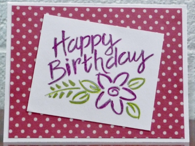
- 6-26-16 WCC Style 2 Out (400x300).jpg (124.13 KiB) Viewed 1323 times
With a lot of decoration inside, which is totally not like me:
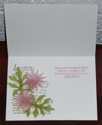
- 6-26-16 Style 2 In (329x400).jpg (82.93 KiB) Viewed 1323 times
When I showed it to my husband, he just shrugs and says it still looks like "me".

Oh well, I tried.